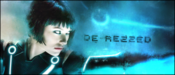
@Koz:
The background doesn't really fit the render too much imo.
A lot of emptyness, it would look much better if you made it less wide.
The lines going over the focal distract me a bit.
I recommend looking at the rule of thirds for focal placement and probably some lighting, and depth tutorials. The light is coming from below him, but on the render the light comes from above. The flow is ok, but not great.
A basic black border looks better in most cases.
The effect is fairly cool but is seems like a different render would be a better fit for it.
Originally Posted by LWafflez

@Koz:
The background doesn't really fit the render too much imo.
A lot of emptyness, it would look much better if you made it less wide.
The lines going over the focal distract me a bit.
I recommend looking at the rule of thirds for focal placement and probably some lighting, and depth tutorials. The light is coming from below him, but on the render the light comes from above. The flow is ok, but not great.
A basic black border looks better in most cases.
The effect is fairly cool but is seems like a different render would be a better fit for it.
Not too mention the render is poorly merged, the border is horrid and the colors are bland and boring.
I recommend this tutorial to everyone that wants to learn about color,
I just read it recently and I can't wait to try it out, so many great tips,
it's very well brought with pictures and examples. This guy is great, enjoy.
Don't forget to leave him a nice message!
http://fxillustrations.deviantart.com/#/d31xj5t
Fr3styL . Improving by Improvising
I'm an artist.
I'm an artist.


just dropping this off here. proud that i made it anyway.
 once you get the hang of it its quite easy. if you want to make awsome like animations its hella lot work tho.